Learn the Basics of Contrasting Colors on the Color Wheel

Color is one of the most important aspects of design. As a designer, it is important to have an understanding of the color wheel and the principles of color theory. One of the most fundamental principles of color theory is contrasting colors. Contrasting colors are colors that are opposite each other on the color wheel. These combinations of colors create a strong visual impact and can add interest and depth to your designs.
Understanding the Basics of the Color Wheel
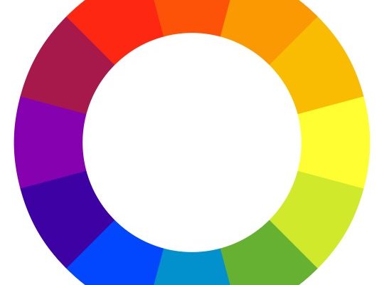
The color wheel is a tool that helps designers to choose colors that work well together. It is made up of primary colors (red, blue, and yellow), secondary colors (green, purple, and orange), and tertiary colors (red-orange, yellow-orange, yellow-green, blue-green, blue-purple, and red-purple). Each color on the wheel has an opposite, or complementary color, located directly across from it.
Contrasting Colors on the Color Wheel
The most basic examples of contrasting colors are red and green or blue and orange, which are directly across from each other on the color wheel. These colors create a strong visual impact and are often used to draw attention to important elements in a design. However, there are many other combinations of contrasting colors on the color wheel. For example, yellow and purple or orange and blue are also contrasting colors that can add interest to your designs.
Using Contrasting Colors in Design
When designing with contrasting colors, it is important to consider the context and the purpose of the design. Contrasting colors are best used sparingly, as they can be overwhelming if overused. They are often used to highlight specific elements in a design or to add visual interest. For example, contrasting colors can be used to create a call-to-action button on a website, making it stand out and encouraging users to click.
In addition to using contrasting colors in your designs, it is important to consider the psychological effects of color. Different colors can evoke different emotions and reactions, so it is important to choose colors that are appropriate for the purpose of your design. For example, red is often associated with energy and passion, while blue is associated with calmness and trustworthiness.
Conclusion
Understanding the basics of contrasting colors on the color wheel is fundamental to designing effective visuals. These combinations of colors are powerful and can add interest and depth to your designs. By using contrasting colors sparingly and considering the context and psychological effects of color, designers can create strong and visually appealing designs that effectively communicate their message.


