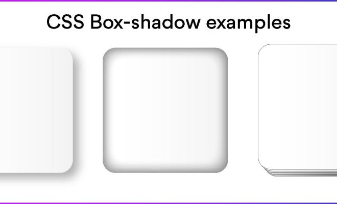
How to Use CSS box-shadow: Tricks and Examples

CSS box-shadow is a powerful tool that can add depth and texture to your web pages. With this tool, you can make elements appear more dynamic, visually appealing, and stand out from other web pages. Here are some tricks and examples to get you started with using CSS box-shadow.
1. Understanding the CSS box-shadow property
Before diving into the examples, it’s important to understand the CSS box-shadow property. The box-shadow property specifies one or more box shadows that attach to an element. The syntax for this property is as follows:
box-shadow: horizontal-offset vertical-offset blur spread color;
– The horizontal-offset and vertical-offset are the distance of the shadow from the element, and can be either positive or negative values.
– The blur and spread values determine the size of the shadow. The blur value determines the amount of blurring around the edges of the shadow, while the spread value determines the amount of spreading of the shadow.
– The color value determines the color of the shadow.
2. Creating a drop shadow effect
One popular use of CSS box-shadow is to create a drop shadow effect. To achieve this effect, you can set the horizontal offset and vertical offset values as 0, the blur value to a higher number, and the color of the shadow to a darker shade of the element’s color. For example:
box-shadow: 0px 0px 10px 0px #888888;
The above code will create a subtle drop shadow effect for the element, without making it look too dramatic.
3. Add multiple shadows for layered effect
You can also add multiple shadows to an element to create a layered effect. To do this, simply separate the values with a comma. For example:
box-shadow: 0px 0px 10px 0px #999999, 0px 0px 15px 0px #555555;
In the above code, we have set two shadows with different blur values and colors, which produces a layered effect.
4. Make an element glow
CSS box-shadow can also be used to make elements glow. To achieve this effect, you can set a lighter shade of the element’s color as the color value for the shadow. For example:
box-shadow: 0px 0px 20px 0px #FADC63;
This code will create a soft glow around the element.
5. Create a simple border effect
CSS box-shadow can also be used to create a simple border effect. To do this, set the spread value to 0 and adjust the other values accordingly. For example:
box-shadow: 0px 0px 0px 2px #333333;
In the above code, we have set the blur and spread values to 0, and increased the size of the shadow by setting the horizontal and vertical offset values to 2px. This gives the element a border-like effect.
In conclusion, CSS box-shadow is a versatile tool that can be used to create a variety of effects for your web pages. With these examples, you can explore the possibilities of box-shadow and see how it can enhance the design of your website.


