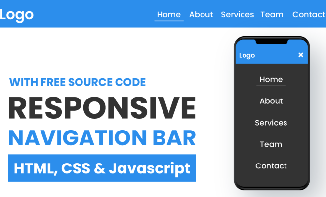
How to Build a Responsive Navigation Bar Using HTML and CSS

In the era of mobile-driven traffic, creating a responsive navigation bar is essential for any website to provide a seamless user experience. A responsive navigation bar ensures that your website is easily navigable and accessible on any device without compromising the design or functionality. In this article, we will guide you on how to build a responsive navigation bar using HTML and CSS.
Step 1: Plan Your Navigation
Before you dive into coding, plan and design your navigation bar. Determine if you need a main menu or sub-menu, the number of menu items you will have, and how you want your menu to look on different screen sizes.
Step 2: HTML Markup
The first step to build a responsive navigation bar is to create the HTML markup. The top level of the navigation should be inside a
tag. In this tag, we will create a
element and assign it a class of ‘main-nav’. Inside our
element, we will create
elements, which are the individual menu items. Each of our menu items will be a link and should have an tag. Here is
an example of HTML markup for our navigation bar:
“`html
Home
About
Services
Contact
“`
Step 3: CSS Styling
Once you’ve created the HTML markup, it’s time to style your navigation bar. We will start with positioning our navigation bar. We can use the ‘position’ and ‘top’ properties to position the navigation bar at the top of the page. We will also assign a background color to our navigation bar using the ‘background-color’ property.
“`css
nav {
position: fixed;
top: 0;
background-color: #333;
width: 100%;
}
“`
Next, we will style our menu items. We can set the ‘display’ property of the
element to ‘inline-block’ to display our menu items horizontally. We will add some padding, margin, and a border to our menu items to make them visually appealing.
“`css
.main-nav li {
display: inline-block;
padding: 10px;
margin-right: 10px;
border: 1px solid #fff;
}
“`
To make our navigation bar responsive, we will use media queries. Media queries allow us to change the styling of our navigation bar depending on the screen size. In our media queries, we will first set the display property of our navigation bar to ‘none’ for screen sizes below 600px. This ensures that our navigation bar is hidden on smaller screens.
“`css
@media only screen and (max-width: 600px) {
nav {
display: none;
}
}
“`
Next, we will create a hamburger menu icon for our smaller screens. We will use the ‘:before’ pseudo-element to create the hamburger menu icon. We will also set the display property of our menu items to ‘none’ for smaller screens, ensuring that they are hidden when the hamburger menu is open.
“`css
@media only screen and (max-width: 600px) {
nav {
display: none;
}
.main-nav li {
display: none;
}
.menu-icon::before {
content: “”;
display: block;
height: 3px;
width: 25px;
background-color: #fff;
margin-bottom: 5px;
}
}
“`
To show the menu items when the hamburger menu is open, we will use JavaScript. We will add an event listener to our hamburger menu icon that toggles the class ‘menu-active’ on our navigation bar. This class will set the display property of our navigation bar to ‘block’ and makes our menu items visible.
“`css
@media only screen and (max-width: 600px) {
nav {
display: none;
}
.main-nav li {
display: none;
}
.menu-icon::before {
content: “”;
display: block;
height: 3px;
width: 25px;
background-color: #fff;
margin-bottom: 5px;
}
.menu-active .main-nav li {
display: block;
}
}
“`
Step 4: JavaScript
To make our navigation bar fully responsive, we need to add JavaScript to toggle the menu items when the hamburger menu icon is clicked. We will create a function that toggles the class ‘menu-active’ on our navigation bar when the hamburger menu icon is clicked. Here is an example of the JavaScript code:
“`javascript
const menuIcon = document.querySelector(‘.menu-icon’);
const menuNav = document.querySelector(‘.main-nav’);
menuIcon.addEventListener(‘click’, () => {
menuNav.classList.toggle(‘menu-active’);
});


