How to Make a Line Graph in Excel

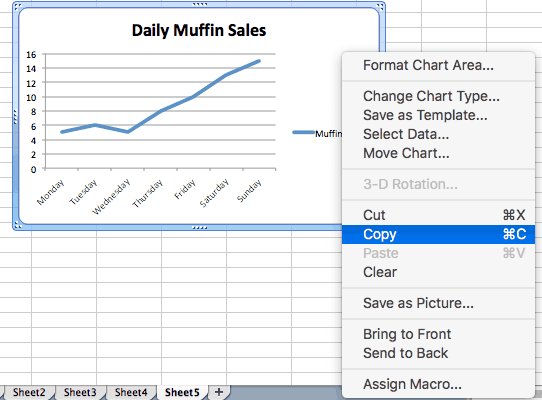
If you’ve ever needed to present data or analyze trends, you know how useful it is to create a line graph in Excel. These graphs allow you to visually display data over time, making trends and patterns easier to identify. But, if you’re new to Excel or not quite sure how to create a line graph, don’t worry, it’s actually quite simple.
Step 1: Gather and input your data
Before you can create a line graph in Excel, you first need to have data to plot. This data can come from a variety of sources, such as survey results, financial data, or scientific experiments. Once you have your data, input it into Excel in a table format. The first column should represent your x-axis values (the independent variable) and the second column should represent your y-axis values (the dependent variable).
Step 2: Highlight your data and open the Chart Wizard
Once your data is in Excel, highlight the table of data you want to create a graph for. Click on the “Charts” button in the toolbar, and select “Line” from the list of chart types.
Step 3: Customize your graph
With your chart selected, Excel will open the “Chart Tools” menu, giving you a variety of customization options.
Labels: You can add or edit titles, axis labels, and data labels by clicking on the “Chart Title,” “Axis Titles,” or “Data Labels” menu items.
Style: You can change the color, style, and thickness of your line by clicking on the “Line Style” and “Color” menus.
Axis Scale: You can set the range and interval of your axis scale by clicking on the “Axis Options” menu.
Legend: You can add or remove the legend from your graph, as well as customize its placement and appearance, using the “Legend” menu.
Step 4: Save and Share your Graph
Once your line graph is complete, it’s time to save and share it with others. You can save your graph as an Excel file, an image file (JPEG, PNG, or BMP), or a PDF. Simply click on the “Save” button in the toolbar and select the file format you want.
Creating a line graph in Excel is a simple process that anyone can do with a little bit of practice. By following the steps above, you can quickly and easily create a professional-looking graph that will help you analyze and understand your data better.


