How to Add Error Bars in Excel

Excel is a powerful tool that businesses and individuals can use to analyze, present, and visualize data. One of the features that makes it so useful is the ability to add error bars to charts.
Error bars are lines that extend from each data point on a chart, indicating the range of possible values for that data point. They help to display the variability or uncertainty in the data and can make it easier to draw conclusions from the chart.
Follow these steps to add error bars to your Excel chart:
Step 1: Create your chart
To add error bars, you’ll first need to create a chart in Excel. Select the data you want to include in the chart and click on the “Insert” tab. Select the chart type you want to create and customize it to suit your needs.
Step 2: Add error bars to your chart
Next, click on the chart to select it, and then click on the “Chart Elements” button on the top right corner of the chart. Select “Error Bars” from the drop-down menu, and choose the type of error bars you want to add.
There are three types of error bars you can choose from:
– Standard Error: This calculates the standard deviation of the data points and draws error bars based on this value.
– Percentage: This calculates error bars based on the percentage of each data point’s value.
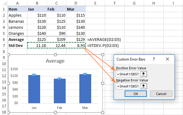
– Custom: This allows you to enter your own values for the error bars.
Step 3: Customize your error bars
Once you’ve chosen the type of error bars to add, you can customize them further. Click on the “More Options” button to access additional options.
Here, you can choose the direction of the error bars, the style and color of the bars, and whether to include end caps or not. You can also choose to display error bars for only one data point, a group of data points, or all data points in the chart.
Step 4: Format your error bars
Finally, you can format your error bars to make them more visually appealing. Click on one of the error bars to select them, and then click on the “Format” tab. Here, you can choose the color, thickness, and style of the error bars.
You can also change the formatting for specific error bars by clicking on them individually, or you can apply the same formatting to all error bars in the chart.
In conclusion, adding error bars to your Excel chart can help you to better visualize and interpret your data. By following these simple steps, you can easily add and customize error bars to your charts


